How to Apply Pantone 2026 Colors to Acetate Watch Design
Applying Pantone 2026 colors to acetate watch design is not just about choosing fashionable shades. It is about translating color direction into a product that looks modern, works with acetate material characteristics, and remains commercially attractive for brands, retailers, and distributors.
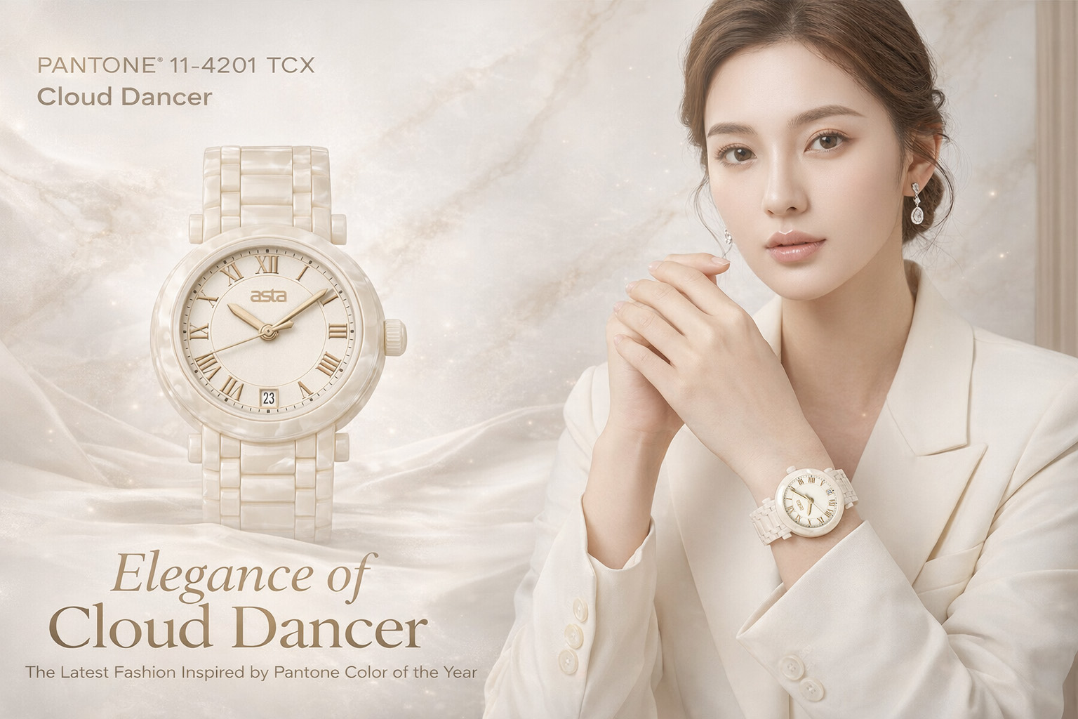
For 2026, Pantone named PANTONE 11-4201 Cloud Dancer as the Color of the Year, describing it as a “key structural color” whose versatility helps other colors shine. Pantone’s New York Fashion Week Spring/Summer 2026 report also emphasizes a mix of divergent colors for self-expression, while the Autumn/Winter 2026/2027 report highlights a balance between grounded, familiar tones and more expressive shades. That combination is especially useful for acetate watches, because acetate performs well both in quiet neutrals and in richer layered color effects.
Why Pantone 2026 Works Well for Acetate Watches
Acetate is one of the best materials for trend-led color application because it naturally supports:
- glossy surfaces
- layered color depth
- transparent and translucent effects
- marbled blends
- tortoiseshell-style variation
- premium fashion presentation
That matters in 2026 because Pantone’s current direction is not only about one hero shade. It is about contrast: soft structure paired with expressive accents, and familiar neutrals paired with more adventurous fashion colors. Acetate can interpret that better than many ordinary plastic materials because it makes color look deeper and more dimensional. The point about Pantone’s 2026 direction comes from Pantone’s official 2026 color pages; the acetate application is a design inference based on the material’s well-known visual strengths.
Start with Cloud Dancer as a Base Tone
The most direct way to use Pantone 2026 in watch design is to treat Cloud Dancer as a base rather than only as a statement color. Pantone explicitly positions it as a versatile structural shade, which makes it ideal for building collections instead of only creating one seasonal style.
In acetate watch development, Cloud Dancer can be applied in several ways:
1. Full Minimalist Case Color
Use a near-Cloud-Dancer milky white or soft off-white acetate for clean, modern watches. This works especially well for women’s fashion lines, unisex capsule collections, and boutique lifestyle products.
2. Accent Layer in Laminated Acetate
Use Cloud Dancer as one layer inside multi-layer acetate construction so it softens stronger surface colors and adds visual brightness.
3. Dial and Strap Contrast
Pair a Cloud-Dancer-inspired case or strap with darker dials, gold markers, champagne details, or smoky transparent acetate sections for a refined contrast.
Because Pantone describes Cloud Dancer as scaffolding for the broader color spectrum, this neutral-led strategy is especially aligned with the official concept behind the color.
Use 2026 as a “Neutral Plus Expression” Color Strategy
Pantone’s 2026 reports point in a clear direction: brands should not think only in bright or only in safe colors. Spring/Summer 2026 emphasizes self-expression, while Autumn/Winter 2026/2027 emphasizes restrained opulence and modernity through a mix of grounded and expressive color. For watch design, that suggests a practical strategy: build collections around one stable neutral family plus one expressive accent family.
For acetate watches, that can translate into:
- Neutral core:Cloud Dancer, warm beige, smoky gray, muted taupe, soft brown
- Expressive accents:translucent berry, mineral green, dusty blue, amber, lacquer-like red, or fashion-forward marbled blends
This structure is commercially useful because it gives distributors and retailers both easy-sell styles and hero styles in the same collection. The collection-building advice is an inference based on Pantone’s 2026 positioning around balance and versatility.
Translate Pantone Trends into Acetate Effects, Not Just Flat Colors
One common mistake in trend-led watch design is treating Pantone as a flat paint reference only. That is too limited for acetate. A better approach is to translate 2026 color direction into material effects.
Here are the most effective ways to do that:
Clouded Translucency
Use semi-transparent white, icy beige, or misty gray acetate inspired by Cloud Dancer for soft, clean watches with a modern feel.
Marbled Contrast
Blend a neutral base with one richer accent tone to create depth without making the watch look too loud.
Tortoiseshell Refresh
Update classic tortoiseshell by lightening the base and introducing softer cream or pale gray undertones to make the pattern feel more 2026 than traditional.
High-Gloss Minimalism
Use simple shapes and quiet shades, then let the polish and acetate depth do the work. This fits especially well with Pantone’s emphasis on structural versatility and restrained sophistication.
Apply Color by Product Tier
Pantone-led design works best when color is matched to market level. Not every customer wants the same intensity.
Entry-Level Fashion Styles
Use easy commercial tones influenced by Cloud Dancer and other seasonless shades. Soft white, ivory, foggy gray, and clear neutral acetate can feel trend-right without becoming risky.
Mid-Range Boutique Collections
Add marbling, layered transparency, and more deliberate contrast between dial, case, and strap.
Premium Private Label Lines
Use deeper color storytelling: mixed laminations, exclusive pattern recipes, and capsule releases tied to a seasonal Pantone mood rather than one single color.
This tiered approach is not stated by Pantone directly; it is a commercial inference from Pantone’s 2026 balance of seasonless structure and expressive fashion direction.
Best Pantone 2026-Inspired Pairings for Acetate Watches
Based on Pantone’s official 2026 color positioning, these pairings make the most sense for acetate watch design:
Cloud Dancer + Honey Tortoiseshell
This keeps the watch commercial while making the tortoiseshell feel lighter and more contemporary.
Cloud Dancer + Smoky Gray
A clean unisex combination that works well for minimalist and private label collections.
Cloud Dancer + Transparent Tea Brown
A softer, more luxurious pairing for boutique channels and gift markets.
Cloud Dancer + Dusty Fashion Accent
This could be a muted green, blue, or berry tone in a marbled or translucent finish, using Pantone’s self-expression direction without becoming overly bold.
These specific pairing ideas are design recommendations inferred from Pantone’s official 2026 descriptions rather than named Pantone pairings.
Think Beyond the Case: Apply Pantone Color Across the Whole Watch
To make Pantone 2026 feel intentional, apply it across the product system rather than only the acetate case.
A stronger design program includes:
- acetate case color
- acetate bracelet or strap inserts
- dial ground color
- seconds hand or marker accents
- logo printing color
- packaging interior tone
- warranty card or hangtag palette
This creates a more complete brand impression. Pantone itself frames Color of the Year 2026 through multiple palettes and broad design application, which supports this more integrated approach.
Build Seasonal Capsules Instead of Overhauling the Whole Collection
Pantone’s 2026 trend reports are useful for planning capsules, limited runs, and seasonal refreshes. For most watch brands, it is smarter to apply Pantone colors to selected seasonal drops rather than redesign every permanent item around one trend cycle.
A practical structure would be:
- Core collection:stable neutral acetate designs
- Trend capsule:2 to 4 Pantone-2026-inspired styles
- Statement piece:one stronger marbled or translucent style for campaign images
This lets brands stay current without overexposing themselves to trend risk. That strategy is a commercial inference from Pantone’s seasonless-color framing and seasonal trend reports.
Match Pantone 2026 to Different Customer Segments
Pantone 2026 can be interpreted differently depending on the target buyer.
For Fashion Boutiques
Use soft neutrals with elegant translucency, polished metal details, and jewelry-style watch shapes.
For Younger Trend Buyers
Use layered acetate, transparent finishes, and stronger contrast between the neutral base and a playful accent.
For Private Label Brands
Use Cloud Dancer-inspired shades as the brand’s clean anchor tone, then build exclusive acetate patterns around it.
For Distributors and Importers
Focus on a small group of easy-sell colorways first. Neutral-led watches are easier to place across multiple channels than highly experimental shades.
These recommendations are commercial inferences from Pantone’s 2026 versatility message and current seasonal positioning.
Avoid These Common Mistakes
When applying Pantone 2026 colors to acetate watch design, avoid three common problems:
Using Flat White Without Depth
Cloud Dancer works because of nuance. A chalky white with no translucency or layering can look cheap instead of refined.
Copying Fashion Color Too Literally
A runway color does not always convert directly into a sellable watch. Use Pantone direction as a guide, then adapt it for scale, gloss, and wrist wearability.
Ignoring Hardware and Dial Balance
Acetate color needs to work with metal plating, index design, and dial finish. Trend color alone cannot rescue an unbalanced watch design.
Final Thoughts
The best way to apply Pantone 2026 colors to acetate watch design is to think in systems, not single shades. Start with PANTONE 11-4201 Cloud Dancer as a versatile structural base, then layer in seasonal expression through marbling, translucency, updated tortoiseshell effects, and carefully chosen accent tones. Pantone’s official 2026 direction supports exactly this balance between stability and self-expression.
For acetate watches, that is good news. Acetate is one of the few materials that can turn a trend color into something deeper, glossier, and more emotionally engaging. Brands that use Pantone 2026 thoughtfully can create collections that feel current, stylish, and commercially practical at the same time.

Leave a Comment ( 0 Comment )
Comments are closed.